Plotting pupillometric data for exploration
It is crucial to validate preprocessing steps by visually inspecting the results using plots. Therefore, pypillometry implements several plotting facilities that encourage active exploration of the dataset. Some of the plotting functions require a Jupyter-notebook with enable widgets (see Installation instructions) so that the plots can be changed interactively, others are purely matplotlib-based.
[62]:
import sys
sys.path.insert(0,"..")
import pypillometry as pp
import pylab as plt ## access matplotlib functions

d=pp.PupilData.from_file("../data/test.pd")
faked=pp.create_fake_pupildata(ntrials=20)
Each PupilData object has a default plot() function that, by default, plots the complete signal at once.
[2]:
plt.figure(figsize=(15,5))
d.plot()
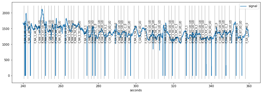
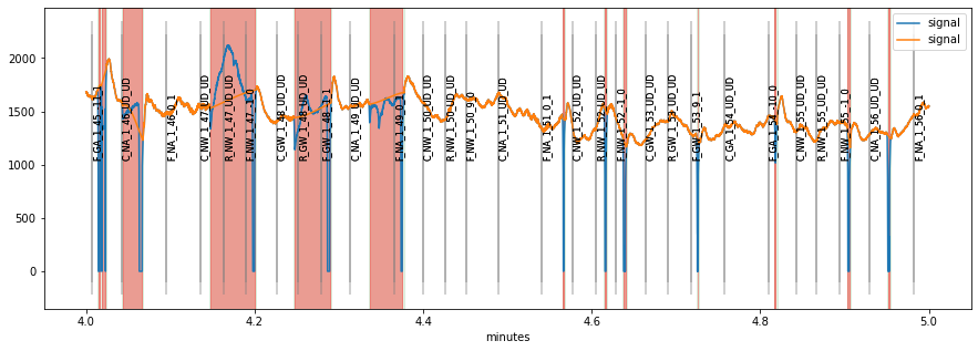
Often, the signal is too long to fit comfortably into one plot, therefore plot allows to specify a range by specifying the plot_range= argument with a tuple giving start end end of the plot. For longer recordings, it can be useful to specify the range in different time units by using units=. pypillometry supports ms (milliseconds), sec (seconds), min (minutes) and h (hours).
[3]:
plt.figure(figsize=(15,5))
plt.subplot(1,2,1)
d.plot((260, 280), units="sec")
plt.subplot(1,2,2)
d.plot((4.5, 4.7), units="min")
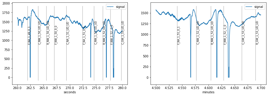
Note that the scale of the plots went all the way to zero because missing data is represented by 0 in the used eyetracker.
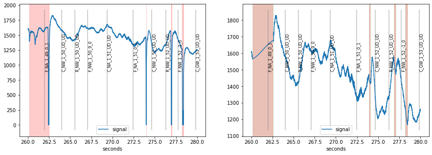
When we detect and interpolate blinks (see blinks-notebook), the scale is adjusted and detected blinks highlighted in red.
[4]:
## detect and interpolate blinks
d=d.blinks_detect()
d2=d.blinks_interp_mahot()

## plot results
plt.figure(figsize=(15,5))
plt.subplot(1,2,1)
d.plot((260, 280), units="sec")
plt.subplot(1,2,2)
d2.plot((260, 280), units="sec")
In order to enable interactive plotting, you can either use widget-based plotting in the jupyter notebook by using interactive=True, or pop-out the plot in matplotlib’s plotting window which allows zooming, moving etc.
[9]:
## produces plot with adjustable x-axis for exploring signal
d.plot(interactive=True)
[12]:
## pops out the plot in matplotlibs native plotting window
%matplotlib
d.plot()
Using matplotlib backend: MacOSX
[21]:
## reset to inline-plotting
%matplotlib inline
In case you are interested in modeling the signal (see notebook modeling pupillometric signal), the plot() function allows to plot the different components (baseline and response-model) as well as the full model.
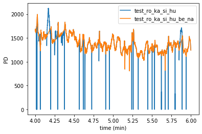
Furthermore, it is also possible to plot several datasets simultaneously using the module-level function plotpd().
By default, the signals are plotted into the same figure in different colors:
[71]:
pp.plotpd(d, d2)
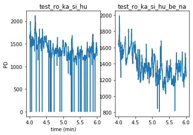
By giving the additional argument subplots=True, we can also plot them separately as above:
[72]:
pp.plotpd(d, d2, subplots=True)
There is also an interactive version plotpd_ia() that produces a figure where the x-axis can be adjusted dynamically.
[73]:
pp.plotpd_ia(d, d2)
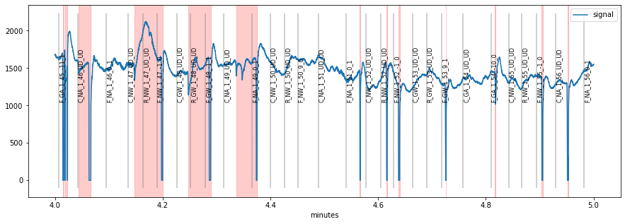
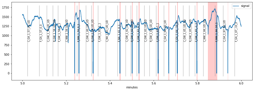
plot_segments()
It is usally a good idea to browse through the whole pupillometric data before and after preprocessing. This can be useful for tweaking preprocessing parameters or for detecting gross artifacts. pypillometry offers a function plot_segments(), that produces as many plots as necessary (each displaying part of the data).
The default is to return a list of matplotlib-Figure objects that can then manually be plotted/inspected.
[42]:
figs=d.plot_segments()
[43]:
for fig in figs:
    display(fig)
The function also allows to specify a (multi-page) PDF-file to which the plots will be saved for later inspection:
[46]:
d.plot_segments(pdffile="/tmp/test.pdf");
> Writing PDF file '/tmp/test.pdf'
Another useful feature of this function is to compare the signals before and after preprocessing using the overlay= argument:
[47]:
figs=d.plot_segments(overlay=d2)
display(figs[0])
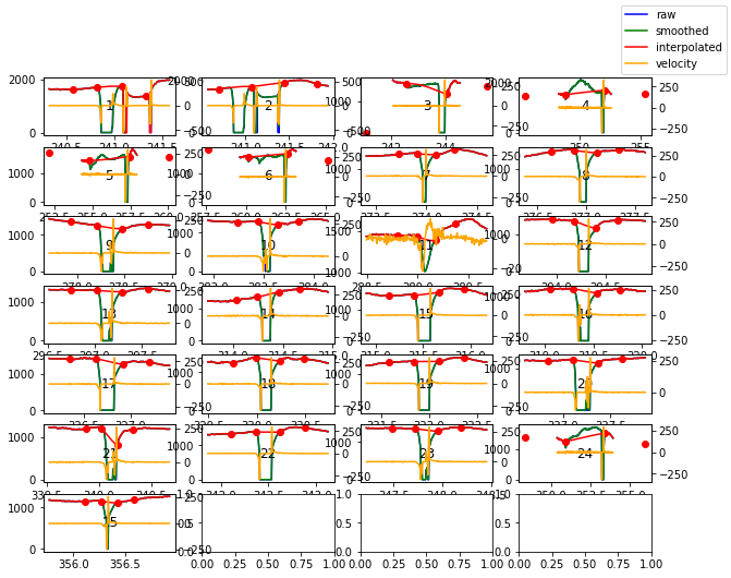
blinks_plot()
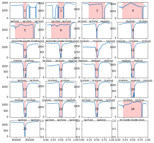
Blinks can be tricky to interpolate. To facilite the process, pypillometry includes a function to plot all detected blinks. The function works similar to plot_segments(), i.e., it returns a list of Figure-objects or allows saving to a PDF file. Each plot contains the index of the currently displayed blink which allows to identify and locate individual blinks in the full dataset.
[59]:
d.blinks_plot(nrow=7, ncol=4)
[59]:
[<Figure size 720x720 with 28 Axes>]
A special diagnostic plotting option for blinks is available in the blinks_interp_mahot() function. When called with the argument plot=True, it will produce plots similar to blinks_plot() but including information used by the Mahot-algorithm implemented in this function (see API docs for details).
[58]:
d.blinks_interp_mahot(plot=True, plot_dim=(7,4));